Y’all ever just suddenly have the overwhelming urge to swim??? Like not actively but you just wanna,,, be in the water and have some Peace
Yes it’s called the mammalian diving response and it’s also why doing face masks and taking a shower is soothing. Our amphibian ancestors used this mechanism to slow down the heartbeat and lower body temperature so as not to waste calories while swimming (which is very calorie intensive). It makes you feel safe because predators are less likely to get you in water than on land. The fish brain is alive and well in all of us.
It’s literally activated by putting water on the face.
My amphibian ancestors gave me the instinct to dissociate in the shower for hours on end
What do you mean they’re less likely to get me in the water?
In the water they can come at me from any direction and it’s harder for me to see
them coming.
“To put it yet another way, in my country where Dukes are actually a thing, there are a grand total of 30 (6 members of the Royal family, 24 others), and while the amount of Duchies in the Kingdom has varied a bit over the years, this number has remained relatively stable. By contrast, although I don’t have access to hard census data for the 19thcentury, Google reliably informs me that there were 2,651,939 people in London in 1851. And, if we take the extremely conservative estimate that only 0.1% of them were people of colour, that means that in the mid-19th century there were 2650 POCs in London compared to about 30 Dukes in the whole country. So, from a certain perspective, a historical romance about a person of colour set in England in the mid-19th century is 88.3 times more plausible than one about a Duke. But because we’re used to seeing stories about Dukes in the 19th century and we aren’t used to seeing stories about people who aren’t white or heterosexual in the 19th century, stories about the absolutely tiny number of high ranking members of the landed aristocracy seem natural and normal to us while stories about the proportionally much larger number of marginalised people living in England at the time feel implausible or disorientating, even though they’re actually more reflective of the lives of real people.”
See also “relatively few people work for police homicide
departments, or as private investigators, and yet no one blinks at how many detective
novels, shows, movies, etc. are out there.”
This article from 2013 is not super compelling in a general sense, but while researching the Belnord this morning I stumbled across it and read with a certain amount of horror the opening quote:
The Belnord is a powerfully built limestone rental building that occupies an entire city block on the Upper West Side of Manhattan. Many windows are the width of a grown woman’s wingspan.
A GROWN WOMAN’S WINGSPAN.
WOMEN WHERE HAVE YOU BEEN HIDING YOUR WINGS AND JUST HOW WIDE ARE THEY
i’ve stopped trash talking comic sans after learning the font is actually one of the only dyslexia-friendly fonts that come standard with most computers and i advocate for others doing the same
In the event that you would like to continue hating Comic Sans, other dyslexia-friendly alternatives include Arial, Verdana, Tahoma, Century Gothic and Trebuchet.
thank
Random fact: Verdana is one of the few fonts which was specifically designed to be as easy to read as possible, even at smaller type sizes. It was designed this way for use on screen, but the same principles apply in print too. This is part of why some Universities use Verdana as their default font for documents.
“In the event that you would like to continue hating Comic Sans” is one of the best things I’ve ever read on this website
Century Gothic and Trebuchet are both quite handsome typefaces.
I’m partial to Century Gothic as well. It’s serif, but not boring.
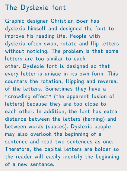
There’s also a dyslexic font designed especially for dyslexic people to read.
You can install on your tablets, laptops and browers etc, so not only can you change things like documents into it, you can change websites into that font as well!
I’m sure you’re bright enough to do a google search, but since I’m dumb enough to forget to post a link, here it is. Better late than never
I default to arial for this reason, but I will now be defaulting to verdana or dyslexie. nice.
I don’t think I have dyslexia but that dyslexie font was the easiest fucking thing to read ever. Books should be written in that shit.
ALSO!!!
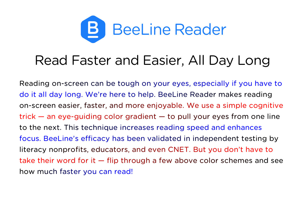
For computer reading, when you mix up lines of text, there’s a web browser app called Beeline Reader. It looks like this
The colors are also customizable, to an extent and while I don’t have dyslexia, I have adhd which makes reading large amounts of text harder and this helps A LOT.